Bag tracking and coordination for private golf club staff and members
Sole product designer · Direct collaboration with founder and dev partner · 8 weeks
TL;DR
Private golf clubs store hundreds of members' bags year-round. Most track them on paper. A founder came in wanting to digitize that clipboard. I went to the bag room first and found two users with incompatible needs sharing one space. Built two separate iOS apps on a shared backend with custom BLE hardware. Demoed at the PGA Conference. Two clubs enrolled on the spot. Five now, several pre-ordering hardware.
Background
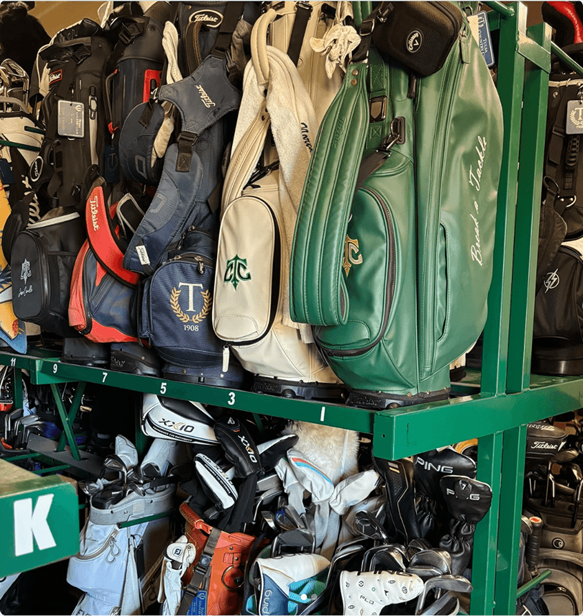
A clipboard problem that turned out to be something else. One or two attendants manage hundreds of nearly identical bags. On a busy Saturday morning, retrieval requests stack up fast. Most clubs were still running this on a spreadsheet and a clipboard.
The founder had lived the chaos as a member. He came in with hardware tracking tags and a simple idea: put the clipboard on a screen. Within a week I realized that wasn't the right product.
The bag room during peak hours. What looked like a logistics problem was actually a speed problem — and a trust problem
Discovery
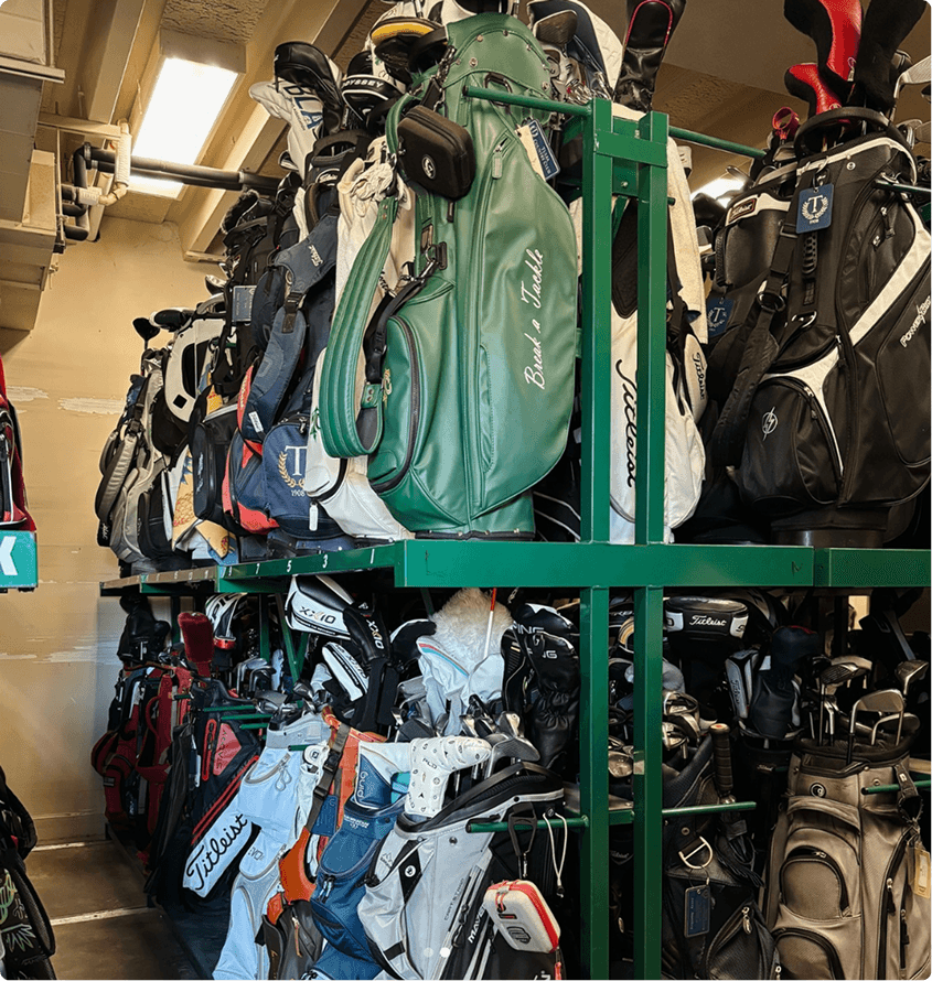
What I found when I actually went there. I went to the bag room before opening Figma. It was bigger than expected, multi-level, minimal visible organization. The attendant navigated it from memory. They'd glance at the spreadsheet to confirm, but they were never really searching.
Watching the Saturday morning rush revealed the bigger issue. There wasn't one problem here. There were two.
Staff needed speed. Any friction under pressure, even a single extra tap, was enough to get the app put down.
Members needed trust. The bag room was a black box. They left equipment worth thousands and had no visibility until they showed up.

"Even 30 extra seconds spent searching for a bag can slow down my flow. I just need to be able to confirm it fast and move on."
-Bag room attendant
The key decision
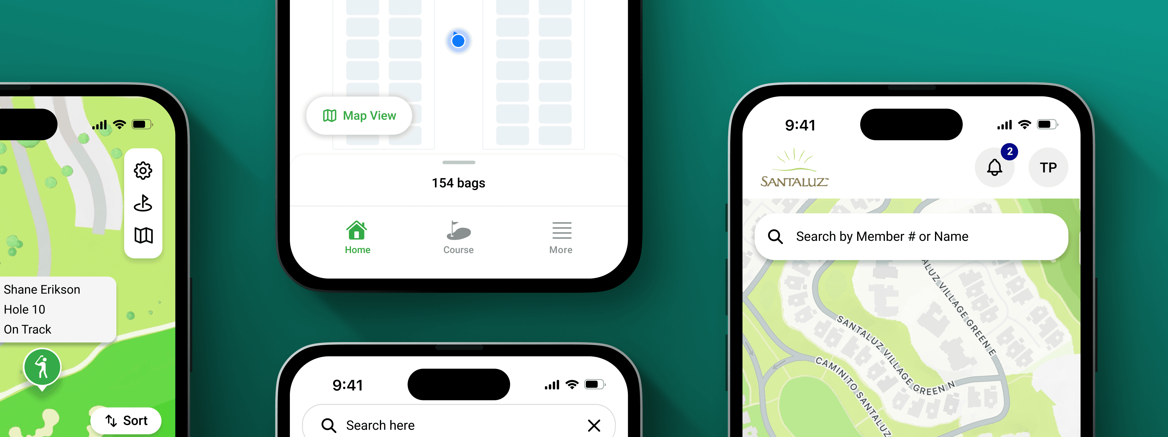
One app or two? I explored a single unified app anyway. Staff need density. Members need calm. Every attempt to serve both in one layout weakened both.
✕ Schedule-based layout — Build around the tee sheet. Breaks on edge cases. Members storing bags without playing. Off-schedule retrievals.
✕ Unified app, two modes — One codebase, mode switching. Compromises weakened both experiences. Abandoned after three screens.
✓ Two apps, one backend — Each surface fully optimized for its user. Neither compromises for the other.


Speed as a hard requirement. Staff don't browse. They locate and retrieve. The on-screen layout mirrors the physical bag room because the attendant already has a mental model of that space built over years. Matching it removes the translation cost entirely.
Entry point:
✕ Quick-action buttons — Check in, check out, locate. Logical shortcuts, but even a labeled button requires a beat of reading. Tested under Saturday pressure. Failed.
✓ Search bar as the only entry point — Type a name or bag ID, get a location, go. Three taps max.


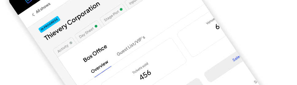
Primary job first, everything else accessible. The member app had broader ambitions: course discovery, check-in, round history, GHIN handicap integration, playing stats. The tension was making sure those features didn't bury the primary job. A member arriving Saturday morning has one question. The home screen needs to answer it first.
✕ Dashboard home screen — Stats, round history, quick-access tabs. Makes bag tracking one item among several.
✓ Primary job first — Bag status and course finder lead. Handicap and stats are one tap away instead of competing for space.
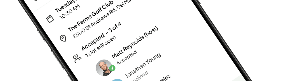
This is a premium club environment. Members are leaving equipment worth thousands in someone else's care. The interface is one of the few signals they have that it was a smart decision.


The ping
When it stopped feeling abstract. Staff can trigger a ping from the bag room grid. The tag responds with an audible sound, helping locate the bag in a dense row of nearly identical ones. A fallback for when the map view gets you close but not close enough.
For members, it's another layer of assurance the clipboard system never offered.
"That's when it stopped feeling like a protoype. I knew right then that we had something real"
-Founder, first bag room demo

A physical confirmation layer for when the map gets you close but not close enough.
✓ Locates a bag by sound when multiple bags are clustered in the same zone
✓ Context-aware — only staff can ping when on club property
✗ Tag battery death silently disables ping with no fallback yet
Why: The ping isn't a marquee feature. It's a gap-filler for the moments where digital tracking alone isn't enough.
The outcome
From one-week sprint to funded product. Two clubs enrolled in beta at the PGA Conference. Five now, several pre-ordering hardware. A handful are contributing financially to the build.
The dual-sided architecture wasn't explained in a deck. It was experienced directly. Clubs sat with the prototype, saw how the staff and member apps worked together, and understood the product in a way no presentation had achieved.
What started as a one-week design sprint is now a funded product in active development.
If I did it again
I validated the spatial grid model at one bag room. I don't know if it holds at a club with a different layout — a single-level room, a smaller operation, a club where turnover means the attendant doesn't have years of mental mapping. That assumption should have been tested at two or three clubs before building around it.
Error states also got less attention than they deserved. What does a member see when a tracker battery dies? What happens when a bag gets moved without being scanned? In a product where trust is the entire value proposition, the edge cases matter as much as the happy path. I'd prioritise those earlier next time.