Mitsubishi Carbon Marketplace
Carbon marketplace prototype to help executives evaluate a new trading desk
Sole product designer · One-week strategic prototype · Direct collaboration with the strategy team
TL;DR
A strategy team had done six months of work building the case for a carbon trading desk. Every executive conversation looped back to the same foundational questions. What would we actually be trading? How do you compare projects? Where does the risk sit? Slides couldn't get them past it. Built a working marketplace prototype in a week that reframed the conversation from market education to operational readiness. One session did what months of decks couldn't.
Background
A strategy team that couldn't get traction. The voluntary carbon market is genuinely complex. Unfamiliar terminology, opaque pricing, regulatory assumptions that shift by region and project type. For executives who hadn't spent time in the space, it was hard to picture what a carbon trading desk would actually do, or what it would look like to make a bid on a reforestation credit versus a solar storage project.
The strategy team had done the work. They understood the market. But every executive conversation looped back to the same basic questions. Slides couldn't answer them because the executives needed something to react to, not something to read.
Questions leadership kept returning to:
What would we actually be trading?
How do you compare one credit to another?
Where does the risk sit?
The design challenge was specific: make an unfamiliar domain navigable to someone with no prior exposure, in a group setting where the goal is alignment not education.
The design approach
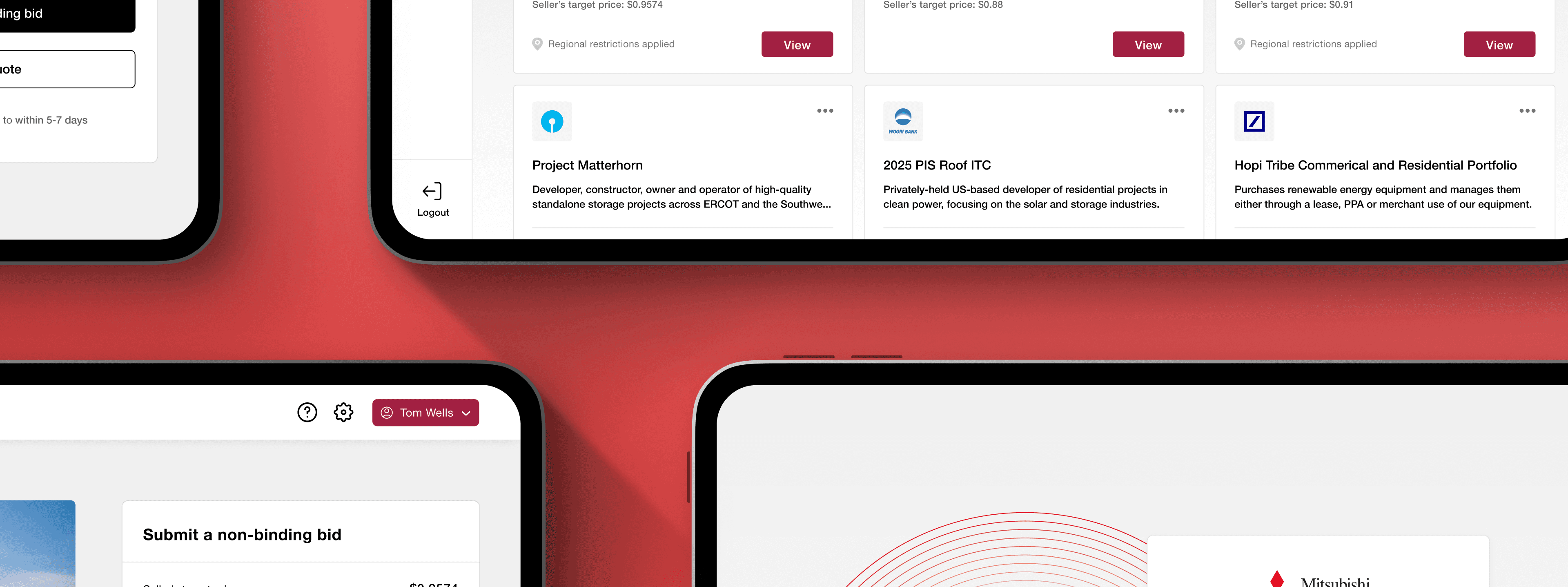
Use an interface pattern executives already understood. Carbon trading is complex. E-commerce isn't. Projects as scannable cards, filters by credit value and geography, a quick-view modal before committing to detail. The architecture feels immediately navigable even when the content is new. A real trading interface built for practitioners would be denser. It would have lost this room.
Information Architecture
Three layers, each with a job. Each layer was designed to do a specific thing in the room, not just to display information, but to force a particular kind of engagement.
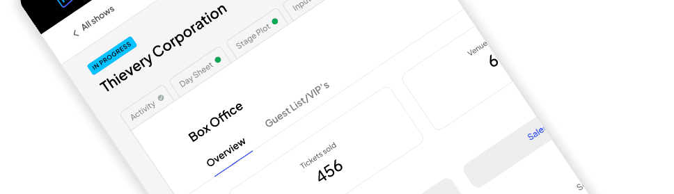
Layer 1: The marketplace view Gives executives the shape of the market. What types of projects exist, what's the range of credit values, what geographies are in play. Orientation before evaluation.
Layer 2: The quick-view modal Financial snapshot. Target price, estimated value, credit volume. Where the conversation shifts from categories to specifics and the comparative question surfaces.
Layer 3: The project detail with bid sidebar The deepest screen, designed to provoke. The bid sidebar includes fields for non-binding bids, target execution dates, and deal terms. Making those fields visible forced a specific question: do we actually have the data to make this bid today?

Three screens, each designed to force a different kind of engagement, not just display information.
The prototype

The entry point. Project types, credit values, and geographies at a glance. Designed to give executives the shape of the market before they evaluate anything specific. Familiar card pattern — scannable without instruction.

Financial snapshot surfaced without navigating away. Target price, estimated value, credit volume. This is where the conversation shifts from categories to comparison.

The bid sidebar was the most intentional decision in the whole project. Non-functional by design. Empty fields make the absence of readiness visible in a way a slide never could.
One session did what months of decks couldn't. The conversation changed in the room. Leadership moved off the foundational questions and onto questions that only matter if you're seriously considering a move: what's our risk appetite, what data infrastructure would we need, what counterparties are realistic.
Those questions don't come from a slide. They come from someone having clicked through a bid on a solar storage project and realizing they don't know what they'd pay for it.
I made decent calls on the information hierarchy — marketplace to modal to detail — but I got there through instinct rather than anything mapped out deliberately. Writing that structure down before designing the screens would have made the whole thing easier to explain and defend.
I'd also spend more time upfront defining what a good session actually looks like. "The conversation changed" is true but vague. If I'd worked with the strategy team to nail down the specific questions they needed leadership to answer — and designed the prototype to provoke exactly those questions — I could have been more precise about whether it worked and where it fell short.