Tee time coordination that takes the friction out of organizing a golf group
Sole product designer · End-to-end: research, product strategy, UI, brand identity, marketing site · Direct collaboration with founder
TL;DR
A golfer came in frustrated with the coordination overhead of organizing a weekly group — four days of group chats and individual texts just to fill four spots. The root problem wasn't the tools. It was that every coordination app starts with invites, which builds uncertainty in from the start. Flipped the sequence: players set availability first, host sees who's already free before sending anything. Launching summer 2026.

Background
It's not a booking problem. It's a social one. The client came in with the pain clearly identified: coordinating tee times through group chats, Instagram DMs, and text threads was fragmented and frustrating. He wanted a shared calendar and a single place for those conversations. That was the right instinct about where the friction was.
But the more I got into it, the more I realized the root problem wasn't where the conversations were happening. It was the structure of the coordination itself. The host was being asked to manage people. Everything I designed had to remove that burden.

Research
Where the evidence came from. The client walked me through a tee time he'd tried to organize the previous month. Posted in the group chat on a Tuesday. By Thursday he had two replies, one a maybe. He ended up texting all six people individually, got four confirmed by Saturday morning, and one dropped an hour before. He found a replacement through a separate thread while warming up on the range. Four days of work that left him not wanting to organize the next one.
The competitive landscape. Every direct competitor — Quick9, Double Ace Golf, 18Birdies Round Scheduler, Social Tee Time — attempts to solve the same problem. None of them are availability-first. Every one starts with the host creating an event and waiting for responses. The social burden stays with the organizer in all of them.

Everyone starts with invites. I flipped the sequence. Every coordination tool starts the same way: who do you want to invite? Pick people, send the invite, wait. That builds uncertainty in from the start. You're guessing who's free. If they don't reply, you follow up. The host carries all of it.
Users set their availability first. When a host wants to organize a round, they can see before sending a single message who's already indicated they're free.
The shift: from "who should I ask?" to "here are eight people who are already free Saturday morning — which four do I want?"

Mapped before any screen design — working out where the host's involvement ends and the system takes over.
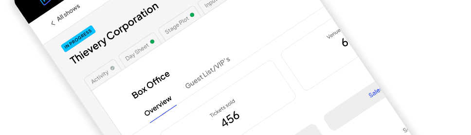
The availability tab
The feature I'm most proud of. Simple surface: choose which days and time windows work for you this week. Morning, late morning, afternoon, evening. Fifteen seconds.
How much granularity?
✕ Specific time slots — More precise (7am vs 9am is a real difference). Too granular to maintain week to week. People stop updating it. The signal collapses.
✓ Time windows (morning / late morning / afternoon / evening) — Accurate enough to be useful. Simple enough that people actually keep it updated.


Player sets availability in under 15 seconds. Host immediately sees who's free before sending anything.
Let the system do the uncomfortable work. Once the host sees who's free, they build an invite queue. The host doesn't manage the queue after sending. They set the logic once and step back.
How does the system handle non-responses?
✕ "Send reminder" button for the host — Keeps the host in control. But the host is still the nag. Social discomfort doesn't go away, it gets one more step of friction.
✓ Automatic queue progression — If someone doesn't respond in time or declines, the system moves to the next person automatically. Host set the order once. After that, nothing required.
Three invite modes: Roster (queue works through a set order), First Come First Serve (first to accept wins), Manual (hand-pick directly). An early version had five. I cut two after working through realistic scenarios with the client — they solved edge cases that come up maybe once a season. Keeping them meant reading five options every single time. Removed, documented for v2.


The host shouldn't have to wonder. After invites go out, the host can see who's accepted, who's declined, who's currently invited and how long they have to respond. The invite is progressing. Something is happening even when the host does nothing. That's the design goal: replace anxiety with visible evidence that the system is handling it.
When all spots fill, the view compresses to just the confirmed four. No celebration screen. The product's tone is calm throughout — a confetti moment would be tonally wrong for something designed to feel effortless.


Groups
Reusable, not rebuilt every time. I designed groups as persistent containers because rebuilding the same four people from scratch every weekend is unnecessary friction. The group exists, has history — starting a new round with it takes one tap from the main entry point.
An early version surfaced member activity inside the group view — response rate, last played. I thought it would help hosts make better invite decisions. It felt like a scoreboard. Golf already has enough built-in social hierarchy. Adding a visible response rate creates pressure, not removes it. Removed entirely.
The early version also had a dedicated "Add tee time" button inside the group. We cut it. Multiple entry points to tee time creation fragment the flow and add decisions before the host has done anything. The group's job is to hold the roster and the history. Tee time creation lives at the top level where it belongs.


Brand & marketing site
I also designed the logo and marketing site to support early user acquisition. The goal was to communicate the core value prop quickly and clearly to someone who had never heard of the product before.


The outcome
The response you want from a first session. Two rounds of prototype walkthroughs with golfers outside the founding team. The availability-first model clicked immediately. The question that came up wasn't "how does this work" but "why doesn't GolfNow do this already."
On track for App Store release summer 2026. The real test won't be first use. It'll be whether golfers keep their availability updated week to week once the novelty wears off. That's the assumption the whole product rests on and it won't be proven until it's live.
If I did it again
I never validated whether people would actually maintain their availability week to week. That's the biggest assumption in the whole product and I designed around it without testing it. A lightweight simulation — even asking a golf group to update a shared spreadsheet weekly for a month — would have told me a lot before building anything.
The cancellation and rebooking flow also got less design attention than the rest. What happens when someone drops the morning of the round? That's probably the highest-stress moment in the coordination cycle and it was the roughest part of the design. It needed more time.